Node Shapes
There are three main types of shapes : polygon-based, record-based and user-defined.
The record-based shape has largely been superseded and greatly generalized
by HTML-like labels.
That is, instead of using shape=record, one might
consider using shape=none, margin=0 and an HTML-like label.
The geometry and style of all node shapes are affected by
the node attributes
fixedsize,
fontname,
fontsize,
height,
label,
style and
width.
Polygon-based Nodes
The possible polygon-based shapes are displayed below.

box
polygon
ellipse
oval
circle
point
egg
triangle
plaintext
plain
diamond
trapezium
parallelogram
house
pentagon
hexagon
septagon
octagon
doublecircle
doubleoctagon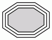
tripleoctagon
invtriangle
invtrapezium
invhouse
Mdiamond
Msquare
Mcircle
rect
rectangle
square
star
none
underline
cylinder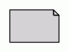
note
tab
folder
box3d
component
promoter
cds
terminator
utr
primersite
restrictionsite
fivepoverhang
threepoverhang
noverhang
assembly
signature
insulator
ribosite
rnastab
proteasesite
proteinstab
rpromoter
rarrow
larrow
lpromoter
As the figures suggest, the shapes rect and rectangle are synonyms for box, and none is a synonym for plaintext.
The shape plain is similar to these two, except that it also enforces
width=0 height=0 margin=0, which guarantees that the actual size of the node is entirely determined by the label.
This is useful, for example, when using HTML-like labels.
Also, unlike the rest, we have shown these three, as well as underline,
without style=filled
to indicate the normal use. If fill were turned on, the label text would
appear in a filled rectangle.
The geometries of polygon-based shapes are also affected
by the node attributes
regular,
peripheries and
orientation.
If shape="polygon", the attributes
sides,
skew and
distortion are also used.
If unset, they default to 4, 0.0 and 0.0, respectively.
The point shape is special in that it is
only affected by the peripheries,
width and
height attributes.
Normally, the size of a node is determined by smallest width and height
needed to contain its label and image, if any, with a margin specified by
the margin attribute. The width
and height must also be at least as large as the sizes specified by the
width and
height attributes, which specify
the minimum values for these parameters.
See the fixedsize attribute
for ways of restricting the node size.
In particular, if fixedsize=shape, the node's shape will be fixed
by the width and
height attributes, and the shape
is used for edge termination, but both the shape and label sizes are used
preventing node overlap. For example, the following graph:
digraph G {
  {
    node [margin=0 fontcolor=blue fontsize=32 width=0.5 shape=circle style=filled]
    b [fillcolor=yellow fixedsize=true label="a very long label"]
    d [fixedsize=shape label="an even longer label"]
  }
  a -> {c d}
  b -> {c d}
}yields the figure:

Note that the label of the yellow node, with fixedsize=true, overlaps
the other node, where there is sufficient space for the gray node with
fixedsize=shape.
The shapes: note, tab, folder,
box3d and component were provided by Pander.
The synthetic biology shapes:
promoter,
cds,
terminator,
utr,
primersite,
restrictionsite,
fivepoverhang,
threepoverhang,
noverhang,
assembly,
signature,
insulator,
ribosite,
rnastab,
proteasesite,
proteinstab,
rpromoter,
rarrow,
larrow and
lpromoter
were contributed by Jenny Cheng.
Record-based Nodes
NOTE: Please see the note about record-based nodes. Also note that there are problems using non-trivial edges (edges with ports or labels) between adjacent nodes on the same rank if one or both nodes has a record shape.
These are specified by shape values of "record" and "Mrecord".
The structure of a record-based node is determined by
its label,
which has the following schema:
| rlabel | = | field ( '|' field )* |
| where field | = | fieldId or '{' rlabel '}' |
| and fieldId | = | [ '<' string '>'] [ string ] |
Braces, vertical bars and angle brackets must be escaped with a backslash character if you wish them to appear as a literal character. Spaces are interpreted as separators between tokens, so they must be escaped if you want spaces in the text.
The first string in fieldId assigns a portname to the field and can
be combined with the node name to indicate where to attach an edge
to the node. (See portPos.)
The second string is used as the text for the field; it supports the usual
escape sequences \n, \l and \r.
Visually, a record is a box, with fields represented by alternating rows of horizontal or vertical subboxes. The Mrecord shape is identical to a record shape, except that the outermost box has rounded corners. Flipping between horizontal and vertical layouts is done by nesting fields in braces "{...}". The top-level orientation in a record is horizontal. Thus, a record with label "A | B | C | D" will have 4 fields oriented left to right, while "{A | B | C | D}" will have them from top to bottom and "A | { B | C } | D" will have "B" over "C", with "A" to the left and "D" to the right of "B" and "C".
The initial orientation of a record node depends on the
rankdir attribute. If this attribute
is TB (the default) or BT, corresponding to vertical
layouts, the top-level fields in a record are displayed horizontally.
If, however, this attribute is LR or RL,
corresponding to horizontal layouts, the top-level fields are
displayed vertically.
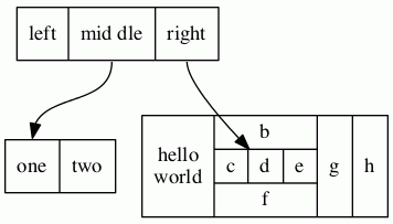
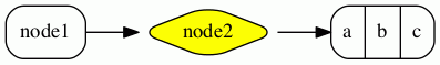
As an example of a record node, the dot input:
digraph structs {
node [shape=record];
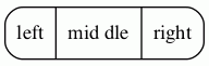
struct1 [label="<f0> left|<f1> mid\ dle|<f2> right"];
struct2 [label="<f0> one|<f1> two"];
struct3 [label="hello\nworld |{ b |{c|<here> d|e}| f}| g | h"];
struct1:f1 -> struct2:f0;
struct1:f2 -> struct3:here;
}yields the figure:
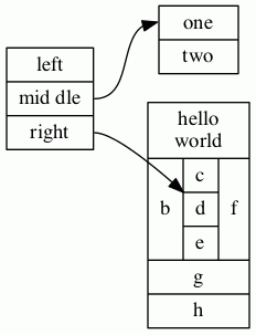
If we add the line:
rankdir=LR
we get the layout:
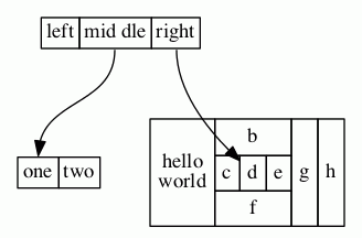
If we change node struct1 to have shape Mrecord,
it then looks like:
Styles for Nodes
The style
attribute can be used to modify the appearance of a node.
At present, there are 8 style values recognized:
filled, invisible, diagonals, rounded.
dashed, dotted, solid and bold.
As usual, the value of the style
attribute can be a comma-separated list of any of these. If the
style contains conflicts (e.g, style="dotted, solid"), the last
attribute wins.
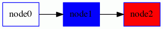
filled- This value indicates that the node's interior should be filled.
The color used is the node's
fillcoloror, if that's not defined, itscolor. For unfilled nodes, the interior of the node is transparent to whatever color is the current graph or cluster background color. Note thatpointshapes are always filled.Thus, the code:
digraph G { rankdir=LR node [shape=box, color=blue] node1 [style=filled] node2 [style=filled, fillcolor=red] node0 -> node1 -> node2 }yields the figure:
invisible- Setting this style causes the node not to be displayed at all. Note that the node is still used in laying out the graph.
diagonals- The diagonals style causes small chords to be drawn near the vertices
of the node's polygon or, in case of circles and ellipses, two chords near
the top and the bottom of the shape. The special node shapes
Msquare,Mcircle, andMdiamondare simply an ordinary square, circle and diamond with the diagonals style set. rounded- The rounded style causes the polygonal corners to be smoothed.
Note that this style also applies to record-based nodes. Indeed,
the
Mrecordshape is simply shorthand for setting this style. Also, prior to 26 April 2005, the rounded and filled styles were mutually exclusive.As an example of rounding, dot uses the graph:
digraph R { rankdir=LR node [style=rounded] node1 [shape=box] node2 [fillcolor=yellow, style="rounded,filled", shape=diamond] node3 [shape=record, label="{ a | b | c }"] node1 -> node2 -> node3 }to produce the figure:
dashed- This style causes the node's border to be drawn as a dashed line.
dotted- This style causes the node's border to be drawn as a dotted line.
solid- This style causes the node's border to be drawn as a solid line, which is the default.
bold- This style causes the node's border to be drawn as a bold line. See also penwidth.
Additional styles may be available with a specific code generator.
HTML-Like Labels
NOTE: This feature is only available on versions of Graphviz that are newer than mid-November 2003. In particular, it is not part of release 1.10.
NOTE: The font markups for bold, italic, underlining, subscript and
superscript (<B>, <I>, <U>, <SUB> and <SUP>)
are only available in versions after 14 October 2011, and
the markup for strike-through (<S>) requires versions later than 15 September 2013.
In addition, all of these markups are
currently only available via the cairo and svg renderers.
The horizontal and vertical rules (<HR> and <VR>)
are only available in versions later than 8 July 2011.
NOTE: For releases later than 9 September 2014, one can use shape=plain so that the size
of the node is totally determined by the label. Otherwise, the node's margin, width and height values may cause the
node to be larger, so that edges are clipped away from the label. In effect, shape=plain is shorthand
for shape=none width=0 height=0 margin=0.
If the value of a label attribute
(label for nodes, edges, clusters, and
graphs, and the
headlabel and
taillabel
attributes of an edge) is given as an
HTML string,
that is, delimited by <...>
rather than "...",
the label is interpreted as
an HTML description. At their simplest, such labels
can describe multiple lines of variously aligned text as provided by ordinary
string labels. More generally, the
label can specify a table similar to those provided by HTML,
with different graphical attributes at each level.
As HTML strings are processed like HTML input, any use of
the ", &, <, and > characters in literal text or in attribute values
need to be replaced by the corresponding escape sequence. For example, if you want to
use & in an href value, this should be represented as &.
NOTE: The features and syntax supported by these labels are modeled on HTML. However, there are many aspects that are relevant to Graphviz labels that are not in HTML and, conversely, HTML allows various constructs which are meaningless in Graphviz. We will generally refer to these labels as "HTML labels" rather than the cumbersome "HTML-like labels" but the reader is warned that these are not really HTML. The grammar below describes precisely what Graphviz will accept.
Although HTML labels are not, strictly speaking, a shape, they can be
viewed as a generalization of the record shapes described above.
In particular, if a node has set its
shape
attribute to none or plaintext, the HTML label will be the node's
shape. On the other hand, if the node has any other shape (except
point), the HTML label will be embedded within the node the
same way an ordinary label would be. Adding HTML labels to record-based shapes (record and Mrecord) is discouraged and may lead to unexpected behavior because of their conflicting label schemas and overlapping functionality.
The following is an abstract grammar for HTML labels.
Terminals, corresponding to elements, are shown in bold font,
and nonterminals in italics.
Square brackets [ and ] enclose optional items.
Vertical bars | separate alternatives.
Note that, as in HTML, element and attribute names are case-insensitive.
(cf. sections 3.2.1 and 3.2.2 of the
HTML 4.01 specification).
| label | : | text |
| | | fonttable | |
| text | : | textitem |
| | | text textitem | |
| textitem | : | string |
| | | <BR/> | |
| | | <FONT> text </FONT> | |
| | | <I> text </I> | |
| | | <B> text </B> | |
| | | <U> text </U> | |
| | | <O> text </O> | |
| | | <SUB> text </SUB> | |
| | | <SUP> text </SUP> | |
| | | <S> text </S> | |
| fonttable | : | table |
| | | <FONT> table </FONT> | |
| | | <I> table </I> | |
| | | <B> table </B> | |
| | | <U> table </U> | |
| | | <O> table </O> | |
| table | : | <TABLE> rows </TABLE> |
| rows | : | row |
| | | rows row | |
| | | rows <HR/> row | |
| row | : | <TR> cells </TR> |
| cells | : | cell |
| | | cells cell | |
| | | cells <VR/> cell | |
| cell | : | <TD> label </TD> |
| | | <TD> <IMG/> </TD> |
All non-printing characters such as tabs or newlines are ignored.
Above, a string is any collection of printable characters, including
spaces. For tables, outside of the body of a <TD> element,
whitespace characters are ignored, including spaces; within a <TD> element, spaces
are preserved but all other white space characters are discarded.
N.B. For technical reasons, if a table is wrapped in a font element such as <FONT>
or <B>, any space immediately before or after this will cause a syntax error. For example,
the label
< <U><TABLE><TR><TD>a</TD></TR></TABLE></U>>
is not legal. Removing either the space or the <U>...</U> will fix this.
HTML comments are allowed within an HTML string. They can occur anywhere provided that, if they contain part of an HTML element, they must contain the entire element.
As is obvious from the above description, the interpretation of white space
characters is one place where HTML-like labels is very different from
standard HTML. In HTML, any sequence of white space characters is
collapsed to a single space, If the user does not want this to happen, the
input must use non-breaking spaces . This makes sense in
HTML, where text layout depends dynamically on the space available. In
Graphviz, the layout is statically determined by the input, so it is
reasonable to treat ordinary space characters as non-breaking. In addition,
ignoring tabs and newlines allows the input text to be formatted for
easier reading.
Each of the HTML elements has a set of optional attributes. Attribute values must appear in double quotes.
- Table element
<TABLE
  ALIGN="CENTER|LEFT|RIGHT"
  BGCOLOR="color"
  BORDER="value"
  CELLBORDER="value"
  CELLPADDING="value"
  CELLSPACING="value"
  COLOR="color"
  COLUMNS="value"
  FIXEDSIZE="FALSE|TRUE"
  GRADIENTANGLE="value"
  HEIGHT="value"
  HREF="value"
  ID="value"
  PORT="portName"
  ROWS="value"
  SIDES="value"
  STYLE="value"
  TARGET="value"
  TITLE="value"
  TOOLTIP="value"
  VALIGN="MIDDLE|BOTTOM|TOP"
  WIDTH="value"
>
- Table row
<TR
  <!-- No attributes -->
>
- Table cell
<TD
  ALIGN="CENTER|LEFT|RIGHT|TEXT"
  BALIGN="CENTER|LEFT|RIGHT"
  BGCOLOR="color"
  BORDER="value"
  CELLPADDING="value"
  CELLSPACING="value"
  COLOR="color"
  COLSPAN="value"
  FIXEDSIZE="FALSE|TRUE"
  GRADIENTANGLE="value"
  HEIGHT="value"
  HREF="value"
  ID="value"
  PORT="portName"
  ROWSPAN="value"
  SIDES="value"
  STYLE="value"
  TARGET="value"
  TITLE="value"
  TOOLTIP="value"
  VALIGN="MIDDLE|BOTTOM|TOP"
  WIDTH="value"
>
- Font specification
<FONT
  COLOR="color"
  FACE="fontname"
  POINT-SIZE="value"
>
- Line break
<BR
  ALIGN="CENTER|LEFT|RIGHT"
/>
- Image inclusion
<IMG
  SCALE="FALSE|TRUE|WIDTH|HEIGHT|BOTH"
  SRC="value"
/>
- Italic style
<I
  <!-- No attributes -->
>
- Bold style
<B
  <!-- No attributes -->
>
- Underline text
<U
  <!-- No attributes -->
>
- Overline text
<O
  <!-- No attributes -->
>
- Subscript text
<SUB
  <!-- No attributes -->
>
- Superscript text
<SUP
  <!-- No attributes -->
>
- Strike-through text
<S
  <!-- No attributes -->
>
- Horizontal rule
<HR
  <!-- No attributes -->
/>
- Vertical rule
<VR
  <!-- No attributes -->
/>
- ALIGN
- specifies horizontal placement. When an object is allocated
more space than required, this value determines where the extra space
is placed left and right of the object.
CENTERaligns the object in the center. (Default)LEFTaligns the object on the left.RIGHTaligns the object on the right.- (
<TD>only)TEXTaligns lines of text using the full cell width. The alignment of a line is determined by its (possibly implicit) associated<BR>element.
The contents of a cell are normally aligned as a block. In particular, lines of text are first aligned as a text block based on the width of the widest line and the corresponding
<BR>elements. Then, the entire text block is aligned within a cell. If, however, the cell's ALIGN value isTEXT, and the cell contains lines of text, then the lines are justified using the entire available width of the cell. If the cell does not contain text, then the contained image or table is centered. - BALIGN
- specifies the default alignment of
<BR>elements contained in the cell. That is, if a<BR>element has no explicit ALIGN attribute, the attribute value is specified by the value of BALIGN. - BGCOLOR="color"
- sets the color of the background. This color can be overridden by a BGCOLOR attribute in descendents. The value can be a single color or two colors separated by a colon, the latter indicating a gradient fill.
- BORDER="value"
- specifies the width of the border around the object in points. A value of zero indicates no border. The default is 1. The maximum value is 255. If set in a table, and CELLBORDER is not set, this value is also used for all cells in the table. It can be overridden by a BORDER attribute in a cell.
- CELLBORDER="value"
- specifies the width of the border for all cells in a table. It can be overridden by a BORDER tag in a cell. The maximum value is 127.
- CELLPADDING="value"
- specifies the space, in points, between a cell's border and its content. The default is 2. The maximum value is 255.
- CELLSPACING="value"
- specifies the space, in points, between cells in a table and between a cell and the table's border. The default is 2. The maximum value is 127.
- COLOR="color"
- sets the color of the font within the scope of
<FONT>...</FONT>, or the border color of the table or cell within the scope of<TABLE>...</TABLE>, or<TD>...</TD>. This color can be overridden by a COLOR attribute in descendents. By default, the font color is determined by the fontcolor attribute of the corresponding node, edge or graph, and the border color is determined by the color attribute of the corresponding node, edge or graph. - COLSPAN="value"
- specifies the number of columns spanned by the cell. The default is 1. The maximum value is 65535.
- COLUMNS="value"
- provides general formatting information concerning the columns.
At present, the only legal value is
*, which causes a vertical rule to appear between every cell in every row. - FACE="fontname"
- specifies the font to use within the scope of
<FONT>...</FONT>. This can be overridden by a FACE attribute in descendents. By default, the font name is determined by the fontname attribute of the corresponding node, edge or graph. - FIXEDSIZE
- specifies whether the values given by the WIDTH and HEIGHT attributes are enforced.
- GRADIENTANGLE="value"
- gives the angle used in a gradient fill if the BGCOLOR is a color list. For the default linear gradient, this specifies the angle of a line through the center along which the colors transform. Thus, an angle of 0 will cause a left-to-right progression. For radial gradients (see STYLE), the angle specifies the position of the center of the coloring. An angle of 0 places the center at the center of the table or cell; an non-zero angle places the fill center along that angle near the boundary.
- HEIGHT="value"
- specifies the minimum height, in points, of the object. The height includes the contents, any spacing and the border. Unless FIXEDSIZE is true, the height will be expanded to allow the contents to fit. The maximum value is 65535.
- HREF="value"
- attaches a URL to the object.
Note that the
"value"is treated as an escString similarly to the URL attribute. - ID="value"
- allows the user to specify a unique ID for a table or cell. See
the id attribute for more information.
Note that the
"value"is treated as an escString similarly to the id attribute. - POINT-SIZE="value"
- sets the size of the font, in points, used within the scope of
<FONT>...</FONT>. This can be overridden by a POINT-SIZE attribute in descendents. By default, the font size is determined by the fontsize attribute of the corresponding node, edge or graph. - PORT="value"
- attaches a portname to the object. (See portPos.) This can be used to modify the head or tail of an edge, so that the end attaches directly to the object.
- ROWS="value"
- provides general formatting information concerning the rows.
At present, the only legal value is
*, which causes a horizontal rule to appear between every row. - ROWSPAN="value"
- specifies the number of rows spanned by the cell. The default is 1. The maximum value is 65535.
- SCALE
- specifies how an image will use any extra space available in its cell.
Allowed values are
FALSE: keep image its natural size. (Default)TRUE: scale image uniformly to fit.WIDTH: expand image width to fillHEIGHT: expand image height to fillBOTH: expand both image width height to fill If this attribute is undefined, the image inherits the imagescale attribute of the graph object being drawn. As with the imagescale attribute, if the cell has a fixed size and the image is too large, any offending dimension will be shrunk to fit the space, the scaling being uniform in width and height if SCALE="true". Note that the containing cell's ALIGN and VALIGN attributes override an image's SCALE attribute.
- SIDES="value"
- specifies which sides of a border in a cell or table should be drawn, if
a border is drawn. By default, all sides are drawn. The
"value"string can contain any collection of the (case-insensitive) characters'L','T','R', or'B', corresponding to the left, top, right and, bottom sides of the border, respectively. For example,SIDES="LB"would indicate only the left and bottom segments of the border should be drawn. - SRC="value"
- specifies the image file to be displayed in the cell. Note that if the software is used as a web server, file system access to images is more restricted. See SERVER_NAME.
- STYLE
- specifies style characteristics of the table or cell. Style characteristics are
given as a comma or space separated list of style attributes. At present, the only
legal attributes are
ROUNDEDandRADIALfor tables, andRADIALfor cells. IfROUNDEDis specified, the table will have rounded corners. This probably works best if the outmost cells have no borders, or theirCELLSPACINGis sufficiently large. If it is desirable to have borders around the cells, use HR and VR elements, or the COLUMNS and ROWS attributes of TABLE.The
RADIALattribute indicates a radial gradient fill. See the BGCOLOR and GRADIENTANGLE attributes. - TARGET="value"
- determines which window of the browser is used for the URL if the object
has one.
See W3C documentation.
Note that the
"value"is treated as an escString similarly to the target attribute. - TITLE="value"
- sets the tooltip annotation attached to the element.
This is used only if the element has a
HREFattribute. Note that the"value"is treated as an escString similarly to the tooltip attribute. - TOOLTIP="value"
- is an alias for TITLE.
- VALIGN
- specifies vertical placement. When an object is allocated
more space than required, this value determines where the extra space
is placed above and below the object.
MIDDLEaligns the object in the center. (Default)BOTTOMaligns the object on the bottom.TOPaligns the object on the top.
- WIDTH="value"
- specifies the minimum width, in points, of the object. The width includes the contents, any spacing and the border. Unless FIXEDSIZE is true, the width will be expanded to allow the contents to fit. The maximum value is 65535.
There is some inheritance among the attributes. If a table specifies a CELLPADDING, CELLBORDER or BORDER value, this value is used by the table's cells unless overridden. If a cell or table specifies a BGCOLOR, this will be the background color for all of its descendents. Of course, if a background or fill color is specified for the graph object owning the label, this will be the original background for the label. The object's fontname, fontcolor and fontsize attributes are the default for drawing text. These can be overridden by using FONT to set new values. The new font values will hold until overridden by an enclosed FONT element. Finally, the pencolor or color of the graph object will be used as the border color.
If you want horizontal or vertical rules used uniformly within a table, consider using the COLUMNS or ROWS attributes rather than using many HR and VR elements.
Because of certain limitations in handling tables in a device-independent manner, when BORDER is 1 and both table and cell borders are on and CELLSPACING is less than 2, anomalies can arise in the output, such as gaps between sides of borders which should be abutting or even collinear. The user can usual get around this by increasing the border size or the spacing, or turning off the table border.
HTML-Like Label Examples
Recreating the Record Example
The dot input:
digraph structs {
    node [shape=plaintext]
    struct1 [label=<
<TABLE BORDER="0" CELLBORDER="1" CELLSPACING="0">
  <TR><TD>left</TD><TD PORT="f1">mid dle</TD><TD PORT="f2">right</TD></TR>
</TABLE>>];
    struct2 [label=<
<TABLE BORDER="0" CELLBORDER="1" CELLSPACING="0">
  <TR><TD PORT="f0">one</TD><TD>two</TD></TR>
</TABLE>>];
    struct3 [label=<
<TABLE BORDER="0" CELLBORDER="1" CELLSPACING="0" CELLPADDING="4">
  <TR>
    <TD ROWSPAN="3">hello<BR/>world</TD>
    <TD COLSPAN="3">b</TD>
    <TD ROWSPAN="3">g</TD>
    <TD ROWSPAN="3">h</TD>
  </TR>
  <TR>
    <TD>c</TD><TD PORT="here">d</TD><TD>e</TD>
  </TR>
  <TR>
    <TD COLSPAN="3">f</TD>
  </TR>
</TABLE>>];
    struct1:f1 -> struct2:f0;
    struct1:f2 -> struct3:here;
}produces the HTML analogue of the record example above:
As usual, an HTML specification is more verbose.
More Complex Example
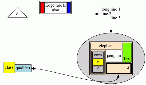
On the other hand, HTML labels are much more general:
digraph G {
  rankdir=LR
  node [shape=plaintext]
  a [
     label=<
<TABLE BORDER="0" CELLBORDER="1" CELLSPACING="0">
  <TR><TD ROWSPAN="3" BGCOLOR="yellow">class</TD></TR>
  <TR><TD PORT="here" BGCOLOR="lightblue">qualifier</TD></TR>
</TABLE>>
  ]
  b [shape=ellipse style=filled
     label=<
<TABLE BGCOLOR="bisque">
  <TR>
      <TD COLSPAN="3">elephant</TD>
      <TD ROWSPAN="2" BGCOLOR="chartreuse"
          VALIGN="bottom" ALIGN="right">two</TD>
  </TR>
  <TR>
    <TD COLSPAN="2" ROWSPAN="2">
      <TABLE BGCOLOR="grey">
        <TR><TD>corn</TD></TR>
        <TR><TD BGCOLOR="yellow">c</TD></TR>
        <TR><TD>f</TD></TR>
      </TABLE>
    </TD>
    <TD BGCOLOR="white">penguin</TD>
  </TR>
  <TR>
    <TD COLSPAN="2" BORDER="4" ALIGN="right" PORT="there">4</TD>
  </TR>
</TABLE>>
  ]
  c [
  label=<long line 1<BR/>line 2<BR ALIGN="LEFT"/>line 3<BR ALIGN="RIGHT"/>>
  ]

  subgraph { rank=same b c }
  a:here -> b:there [dir=both arrowtail=diamond]
  c -> b
  d [shape=triangle]
  d -> c [label=<
<TABLE>
  <TR>
    <TD BGCOLOR="red" WIDTH="10"> </TD>
    <TD>Edge labels<BR/>also</TD>
    <TD BGCOLOR="blue" WIDTH="10"> </TD>
  </TR>
</TABLE>>
  ]
}produces:
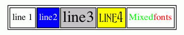
Fonts Example
An example using <FONT> elements:
digraph structs {
    node [shape=plaintext];

    struct1 [label=<<TABLE>
			<TR>
        <TD>line 1</TD>
        <TD BGCOLOR="blue"><FONT COLOR="white">line2</FONT></TD>
        <TD BGCOLOR="gray"><FONT POINT-SIZE="24.0">line3</FONT></TD>
        <TD BGCOLOR="yellow"><FONT POINT-SIZE="24.0" FACE="ambrosia">line4</FONT></TD>
        <TD>
          <TABLE CELLPADDING="0" BORDER="0" CELLSPACING="0">
						<TR>
							<TD><FONT COLOR="green">Mixed</FONT></TD>
							<TD><FONT COLOR="red">fonts</FONT></TD>
						</TR>
          </TABLE>
        </TD>
      </TR>
    </TABLE>>];
}produces:
Images Example
Using an <IMG> element:
digraph structs {
node [shape=plaintext];
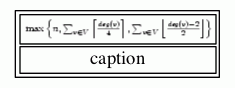
struct1 [label=<<TABLE>
<TR><TD><IMG SRC="eqn.png"/></TD></TR>
<TR><TD>caption</TD></TR>
</TABLE>>];
}produces:
Sides Example
The sides attribute (version 2.37 and later) allows one to combine cells to form
various non-convex shapes. For example, a tee-shaped node
digraph {
  tee [shape=none margin=0 label=
    <<table border="0" cellspacing="0" cellborder="1">
     <tr>
      <td width="9" height="9" fixedsize="true" style="invis"></td>
      <td width="9" height="9" fixedsize="true" sides="ltr"></td>
      <td width="9" height="9" fixedsize="true" style="invis"></td>
     </tr>
     <tr>
      <td width="9" height="9" fixedsize="true" sides="tlb"></td>
      <td width="9" height="9" fixedsize="true" sides="b"></td>
      <td width="9" height="9" fixedsize="true" sides="brt"></td>
     </tr>
    </table>>]
}produces:

User-defined Node Shapes
There is a third type of node shape which is specified by the user. Typically, these shapes rely on the details of a concrete graphics format. At present, shapes can be described using PostScript, via a file or add-on library, for use in PostScript output, or shapes can be specified by a bitmap-image file for use with SVG or bitmap (jpeg, gif, etc.) output. More information can be found on the page How to create custom shapes.
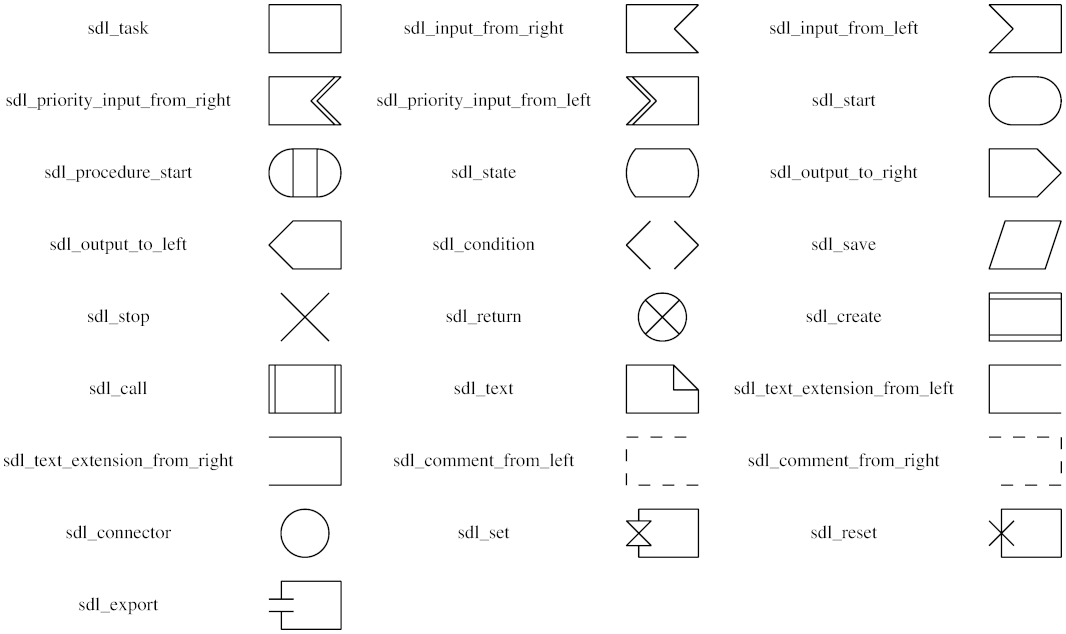
SDL Shapes for PostScript
One example of user-defined node shapes is provided by Mark Rison of CSR.
These are the SDL shapes.
These are available as PostScript functions whose use is described in
External PostScript procedures.
The necessary PostScript library file and sample use can be found in the
contrib/sdlshapes directory in the release. Please note the
COPYRIGHT AND PERMISSION NOTICE contained in the library file sdl.ps.
The table below gives the shape names and the corresponding node shapes: